Many a web designer has sat at their computer monitor in quiet despair, looking at a glowing blank screen wondering how on earth they’ll integrate their client’s logo into a website design they can live with. A logo may seem like a small part of a website design, but it can have a large impact on how a website is designed or perceived.
Many of the businesses I work with have invested a lot of time, effort and money into developing a brand strategy with a beautifully crafted logo. They are very clear about how their business should be represented both online and offline. So at the beginning of the website design process, I’m presented with brand guidelines, colour swatches, and often several official versions of the logo to work with.
Having this type of brand information makes my job so much easier, as knowing the constraints or ‘limiting factors’ I have to take into account with the design gives me a road map I can follow for how the rest of the website should look. I find that I almost always take my design cue from the logo and the feeling it invokes and the overall brand guidelines.

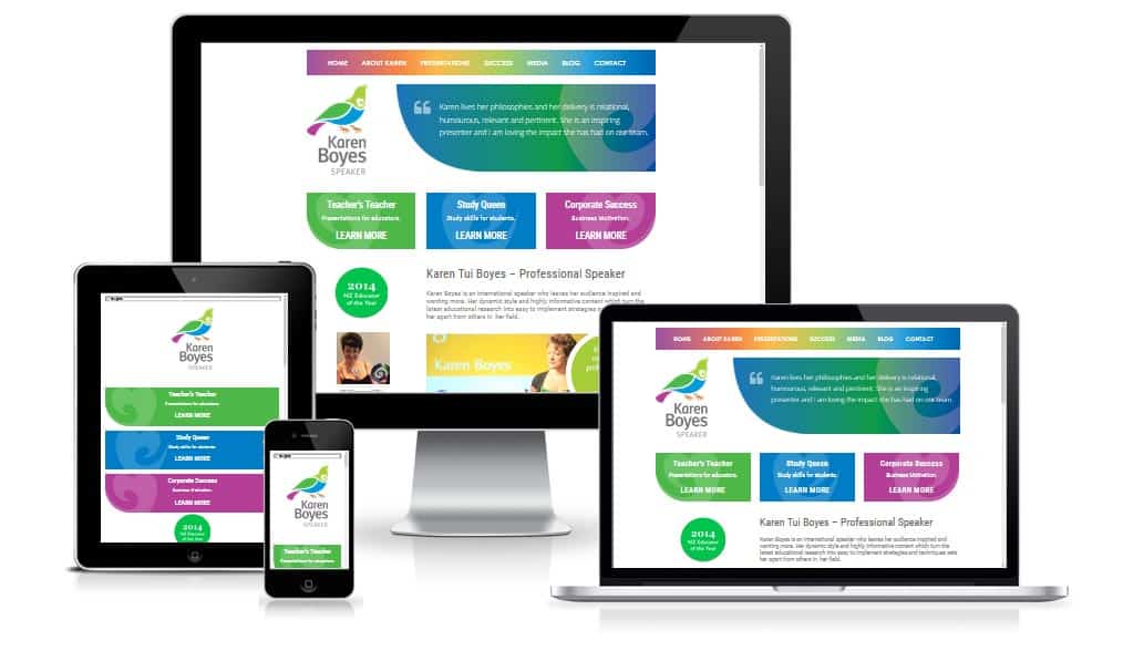
Logos that use a mix of complementary colours, allow me to incorporate that colour scheme in subtle or sometimes not so subtle ways throughout the site (it really depends on the colours). The end result is a design that is pleasing to the eye, colourful and vibrant, but not overpowering. Often logos have design elements like swirls or florets that can be lifted out of the logo and repeated throughout the site as backgrounds or other design elements like bullet points, reinforcing the branding and providing a pleasing visual symmetry. An excellent example of this is a site Web Matter’s designed for speaker Karen Boyes see www.karentuiboyes.com (with logo development by School Branding Matters). Another good example is the Clearview Primary school website – see http://www.clearview.school.nz – another collaboration with School Branding Matters.
With some businesses, I find that even though they’ve had a logo developed professionally, they don’t use it in a consistent way throughout their marketing. Often, logos are used year in and out without any further consideration or review.
Unfortunately, many logos can become very dated due to the use of ‘in vogue’ fonts which now look wrong, and the overall design can start to look (to use a non-technical term which I know you’ll understand) ‘fuddy duddy’.
It’s the very dated logos that present web designers with design challenges and creative blocks. Many times, in my career, I’ve heard web design colleagues express their intense dislike of a logo and some logos use such strong primary colours that people can react quite badly to them – especially designers who have to look at the colours for hours on end. Many years ago, I once found it almost impossible to work on a site’s design, as the logo colour was making me feel ill.
With many logos, I suspect there has been no or little research into colour theory or the psychology of colour. Now I’m no colour expert, but there is a lot of research available that demonstrates the kind of reactions people have to certain colours – just Google ‘psychology of colour’. It’s a fascinating field and crosses all types of design.
Then there are the businesses without a logo, they simply have a cheap template business card with their business name on it and believe that is their ‘logo’. They present quite a unique challenge for a web designer. Yes, it can be freeing to have no constraints, but it’s also very challenging to come up with a logo graphic for a website when you’re not a graphic designer. That’s why if you can afford to hire a professional designer you absolutely should. It will pay off many times over.
From my own experience, I spent the first six months in business with a basic logo I had rushed up in Photoshop. I knew it was pretty average, but I was too busy trying to get my head around being in business to be that bothered about it. However, once I did engage a professional designer and developed my existing logo I had a lightbulb moment where I discovered the logo had a big impact on my perceptions of the business, I felt I would be taken much more seriously and I was happy to hand over my business cards. Quite simply I had a sense of pride over the business. That immediately translated into a new website design and a new confidence that brought with it new business.
Crowd Sourcing your Logo
Logo design can be an expensive exercise, but with the trend towards crowd sourcing you can now take away some of the pain, cost and fear associated with engaging just one graphic designer. With crowd sourcing you pay a fee to have designers compete to win your design competition. I’ve personally recommended crowd sourcing to several of my clients for new brands they have developed, and they’ve been amazed and very pleased with the results achieved.
So if crowd sourcing your logo is something you’d like to consider you can get started with it by going to:
I would only recommend Crowd Sourcing if you really had no money – as you just can’t compare it with hiring a professional designer you can work with locally and understands the market place you are in.
Whatever way you go, best of luck with your logo re-development, and I hope you have a better understanding of how it can impact on the success of your website design and overall marketing.

